
ULOC (TD Bank)
1. Overview
ULOC, short for Unsecured Line of Credit, is a product commercialized by many banks, including Toronto-Dominion Bank (TD).
Through a ULOC, the client can get a loan without linking collateral to it (like a home or a car). This way, the customer can have ongoing access to cash, and the interest rate will likely be lower than that of credit cards.
Note that due to the bank's NDA policy, this case is being explained superficially only with content that was/is live to the general public.
Date and duration
1 year
(Aug 2024 - Aug 2025)
Tools
• Figma
Deliverables
• Current State Analysis
• Wireframing
• Visual Design
2. Problem Definition
Origin
As a UX/UI Designer at TD, I was part of the team responsible for modernizing and expanding EasyWeb, TD's online banking platform. In this project, the goal was to redesign the existing ULOC pages — they were built on an outdated design system and were not responsive, creating friction for both customers and the business.
What was the problem?
Based on the project's needs and the current state analysis, this would be the problem definition to fit this scenario:
How can we modernize ULOC's pages ensuring that the interface is up to date to the bank's design standards, but also improve the customer experience and the product's communication?
3. Discovery
Current State Analysis
When I joined the project, the previous design team had already received some of the requirements written by the business analyst and mapped some of the main functionalities’ current state.
We then documented all existing data points and links to ensure that they were translated into the new designs, and also removed anything irrelevant to the users’ or products’ needs.
Below are some examples of the original ULOC design that was live before this project was implemented.
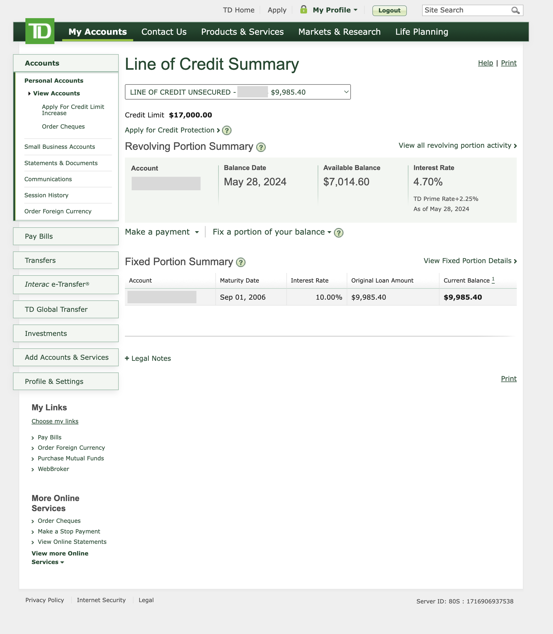
Summary of a line of credit with both revolving and fixed portions
Click on the image to enlarge it
4. Designing
The work started by redesigning the existing live pages, using TD's design system and the business requirements as a base. We created high-fidelity wireframes, which were periodically reviewed by the project's business analyst and product owner for feedback. Working closely with developers was equally important. During design, they helped us understand what was technically feasible, shaping decisions early.
Pair designing made the process sharper. Working alongside another designer — someone equally invested in the outcome to think out loud with — meant problems got solved faster and decisions were better considered. It also became one of the best environments for learning and growth.
Collaborating with other designers extended beyond the immediate team. Since another group was simultaneously modernizing the HELOC (Home Equity Line of Credit) pages — a product similar to ULOC — we held frequent check-ins to keep both products aligned, especially for shared functionalities like filtering and sorting transactions. Small differences were allowed when the products called for it, but consistency was the baseline.
As the project evolved, so did the scope. Technical and conceptual complexity, and multiple customer scenarios uncovered along the way, meant the work grew beyond the initial requirements. Some highlights:
30+ error and edge case scenarios were identified and designed
Component adaptations were made where the design system needed to flex to fit specific situations
User testing was conducted in collaboration with TD's research team to validate design decisions
After the design was finished, we reviewed our work to make sure everything was pixel-perfect and followed all design best practices.
Once implementation began, the collaboration with the developers continued through QA — reviewing built screens against the designs, flagging discrepancies, and working with the team to resolve them before launch.
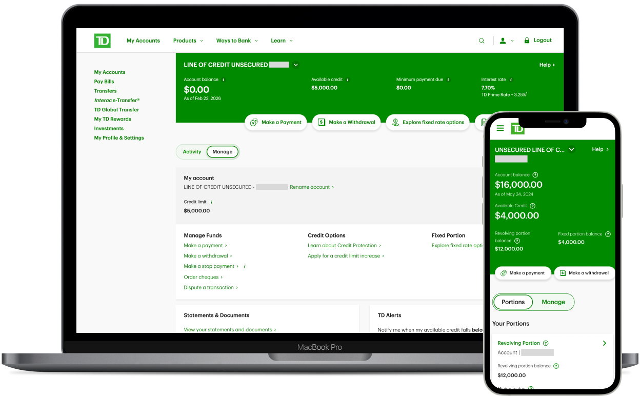
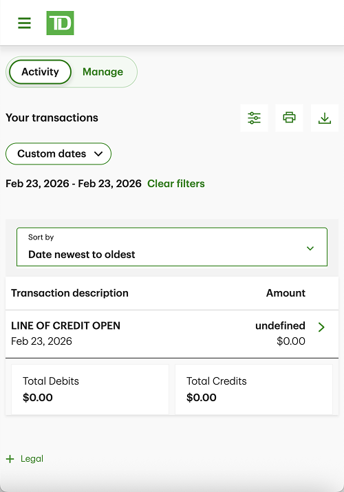
5. Finished product
Since the redesigned pages live behind TD's login, the screenshots below offer a glimpse of the modernized ULOC.
Some of the improvements made were:
Fully responsive pages
Clearer content hierarchy by reorganizing content and highlighting the most relevant information
Adherence to standards by applying the bank's design system, which allows for a consistent experience throughout TD's products
6. Learnings
This project was a lesson in the value of collaboration at every level — with a design partner, with adjacent teams, and with developers. Working within such a structured and large organization meant learning how to:
Navigate complexity without losing sight of the user;
Advocate for design decisions within technical constraints;
Keep consistency across products while still allowing room for nuance.
It also reinforced that good design rarely happens in isolation: the best outcomes came from conversations, not just from the craft.
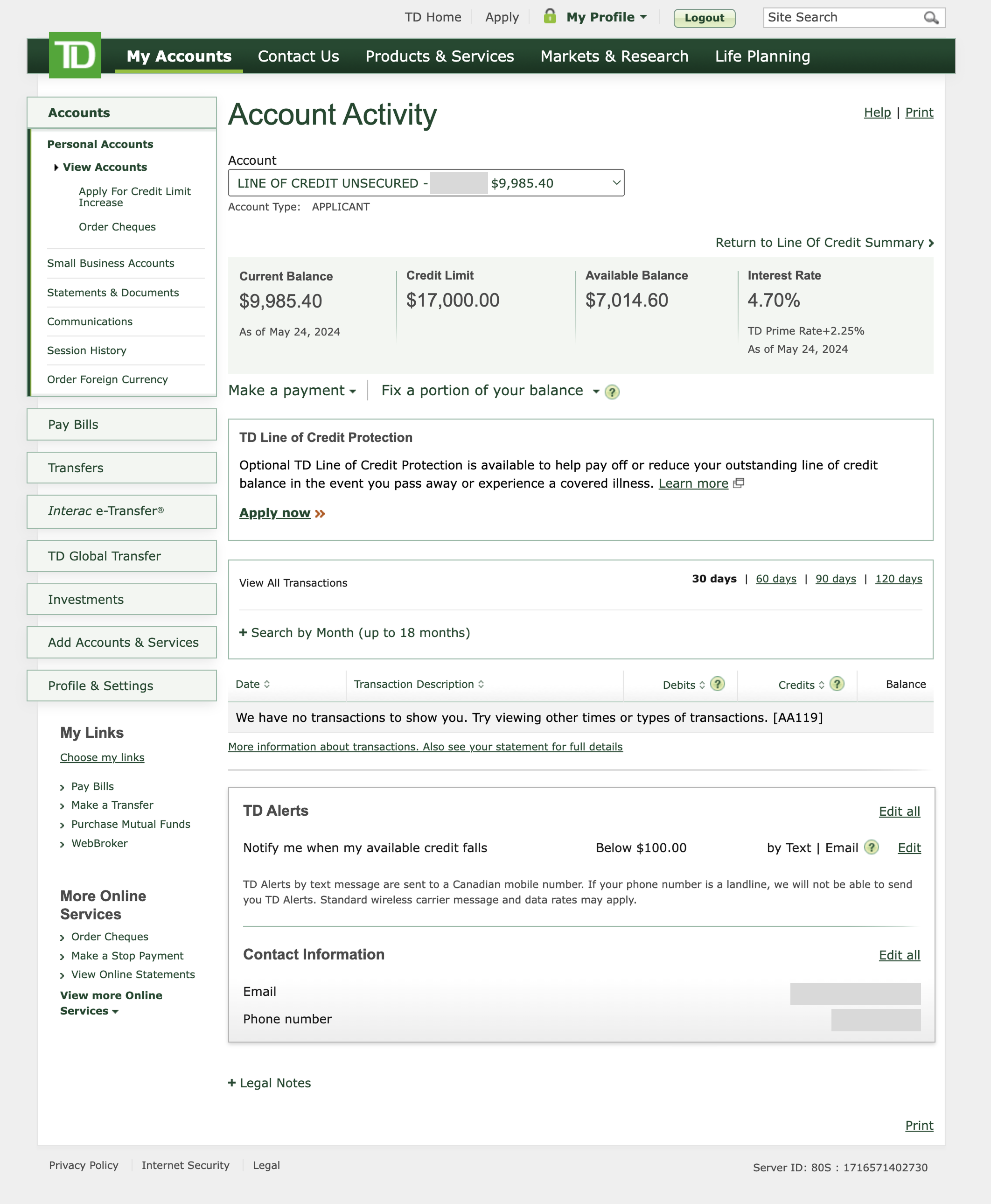
Revolving Portion Activity Page - Old version
Click on the image to enlarge it
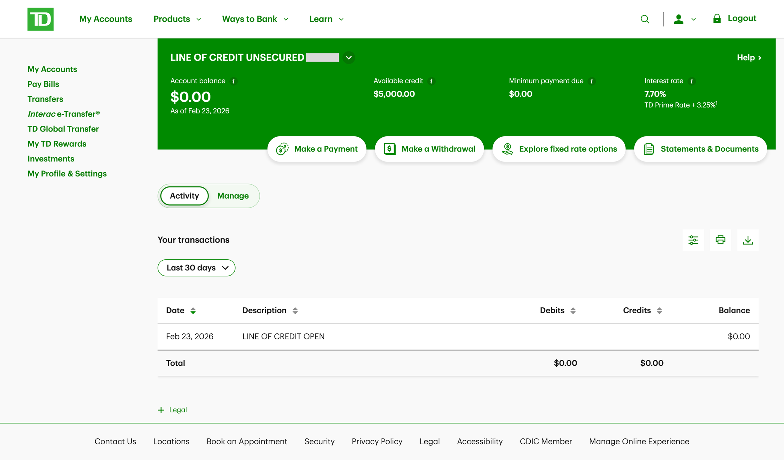
Revolving Portion Activity Tab - New version
Click on the image to enlarge it
Revolving Portion Activity Tab - Filtering by custom dates - New version
Click on the image to enlarge it
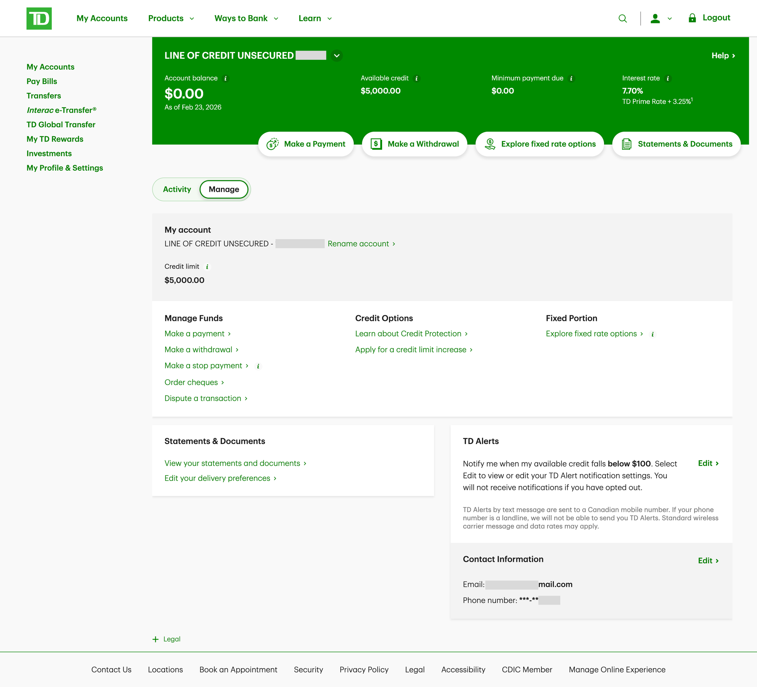
Revolving Page Manage Tab - New version
Click on the image to enlarge it
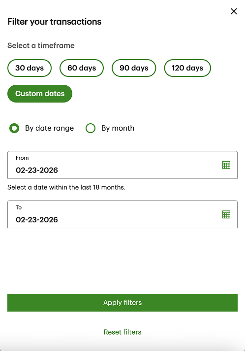
Filter overlay - New feature
Click on the image to enlarge it