
Pridelogue
1. Overview
Pridelogue is a product targeting the LGBTQ2+ community and aims to give users recommendations on movies, TV series and books with characters and stories relatable to the community. The app allows users to search for a title, browse through an extensive database of suggestions, share titles with friends and read and leave reviews and ratings. Academic project made at Centennial College.
Date and duration
4 months
(Jan - Apr 2022)
Tools
• Figma
• Miro
• Adobe Illustrator
Team
Juliana Saboya
(UX Designer)
Deliverables
• UX Research
• User Journey
• Personas
• Sitemap
• Wireframing
• Prototyping
• Usability Testing
2. Problem Definition
Origin
As a member of the LGBTQ2+ community, I have always struggled to find stories with characters like me. Queer movies, TV series and books are not as popular as the ones with straight and cisgender stories. But that type of content exists, and it's really frustrating having to dig deep to find it. It creates a sense of not belonging.
What was the problem?
Based on this thesis, I came up with this problem definition:
How can we make it easier for the LGBTQ2+ community to discover movies, TV series or books made for or about them so that they can feel represented and seen and increase their self-esteem?
3. Discovery
User Research
To get confirmation that this was not just a theory, but a real-life problem faced by the community as a whole, I conducted a survey on Google Forms, and most of them identified as part of the LGBTQ2+ community. This is what I found out:
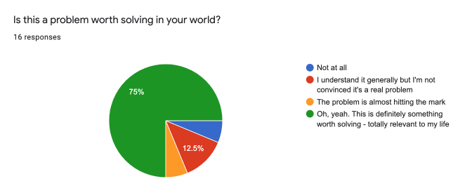
75% of respondents said that this is a problem totally relevant to their lives.
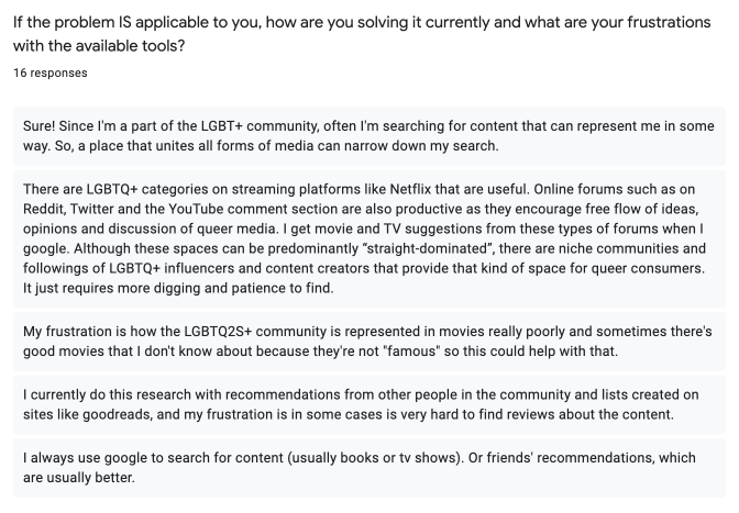
People also said that they resort to multiple platforms to find content and the process is difficult.
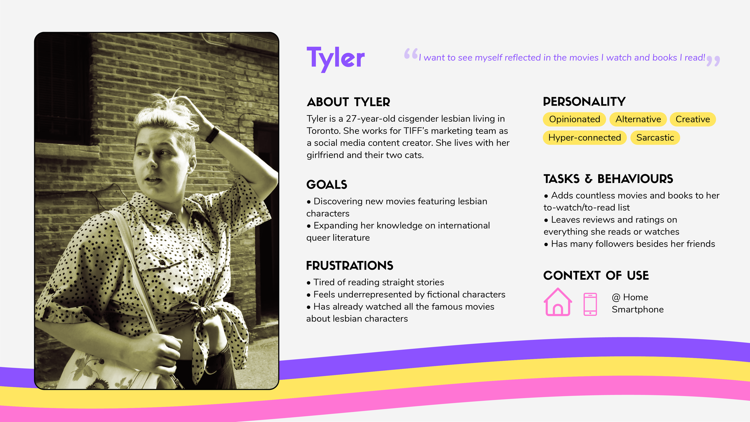
Persona
By analyzing the survey results, I was able to come up with this persona, Tyler, to represent the community's issues.
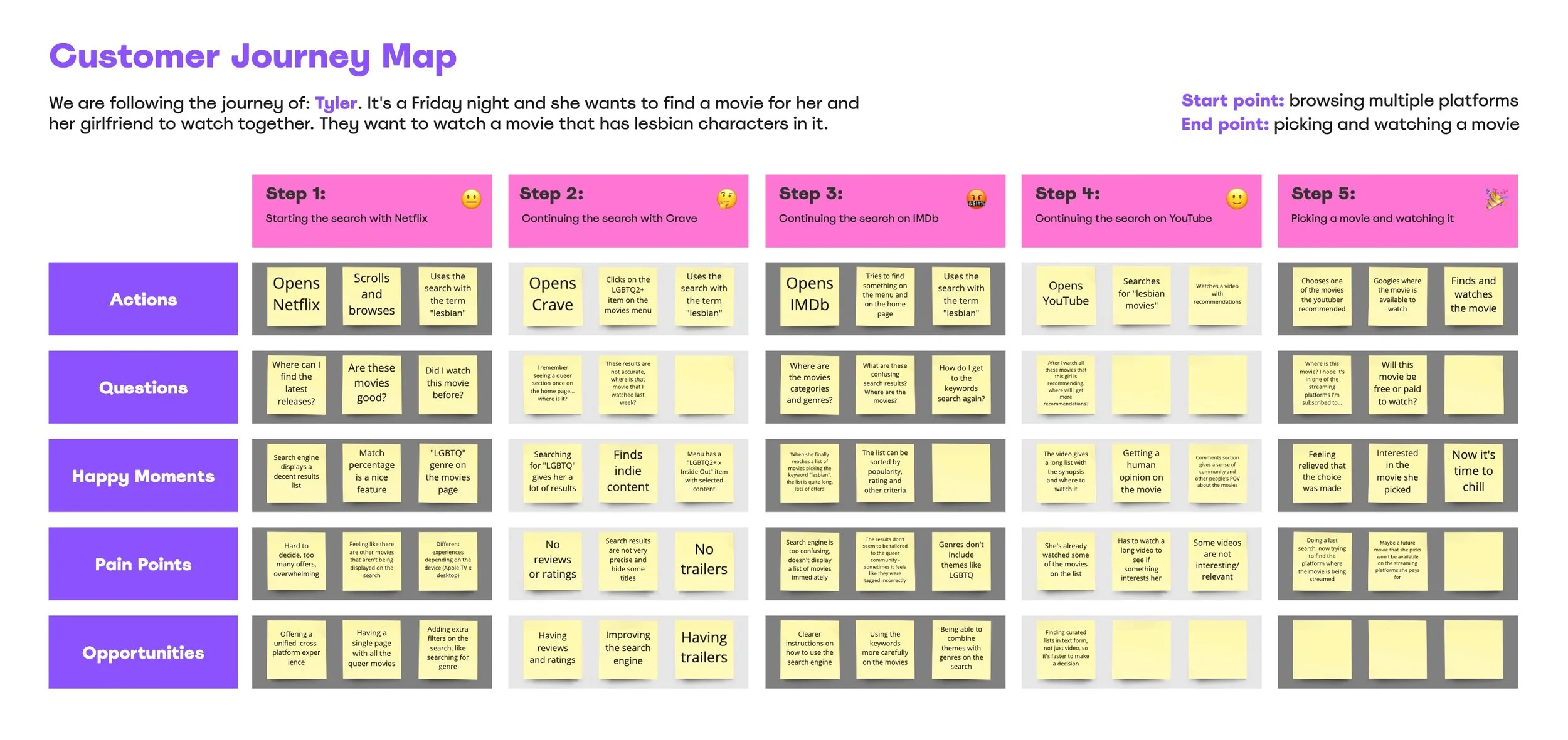
Customer Journey Map
I put myself in Tyler's shoes and pictured how she might perform a search for a new movie to watch with her girlfriend, how she would feel during this process, as well as opportunities for improvement:
Current User Journey
Alternatively, I also created the user journey that exemplifies the steps that this persona had to go through in order to look for LGBTQ2+ content:
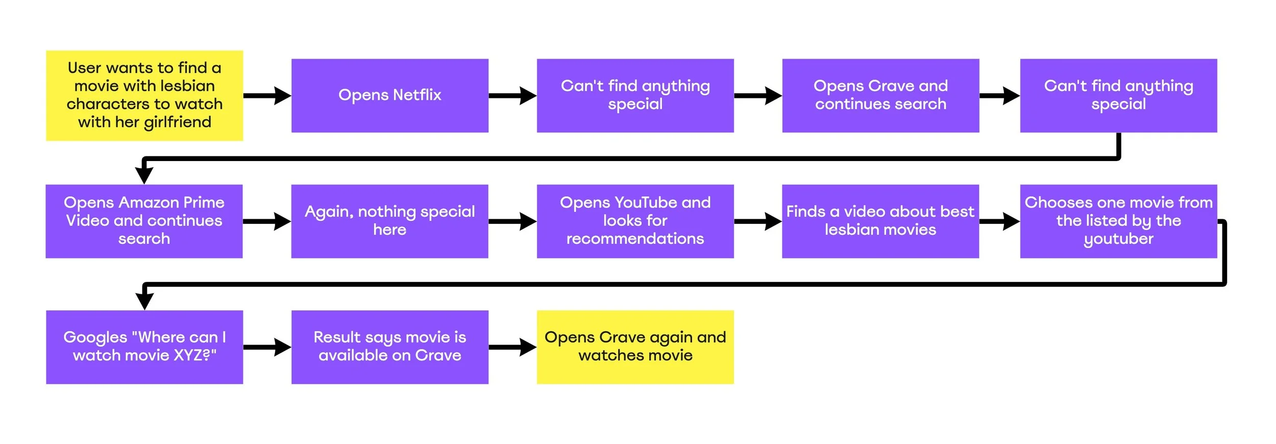
Even without reading all the steps, you can see that's A LOT of work!
The possibilities of user journeys are endless since each person is resorting to different platforms to perform searches and find something that piques their interest. The point here was to exemplify the complexity of the process. On top of that, by doing a quick competitive analysis, I also realized that the streaming platforms’ search engines are not 100% effective; their content is very much segmented depending on the specific terms you use to perform the search. If you don't pick the right word, you might miss some movies/TV series in their catalogue.
4. Designing
Site Map
After concluding the initial discovery phase, it was time to start thinking about what this product would be like. The site map went through some iterations and the final version can be seen below:
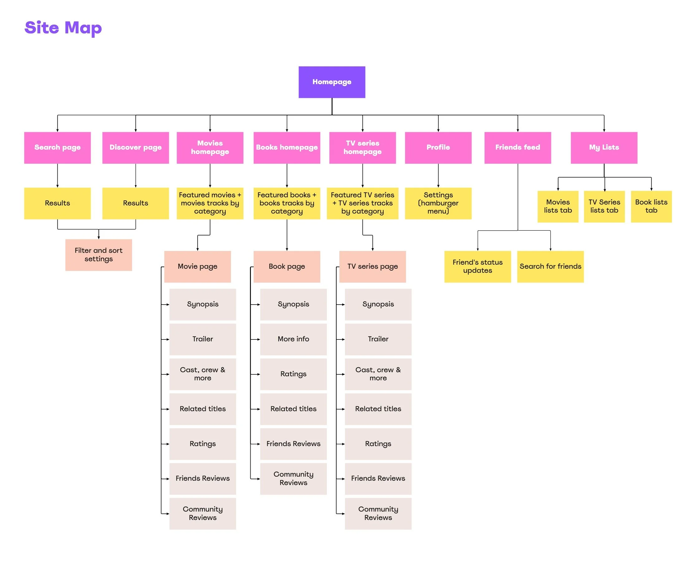
My idea was to give users not only the possibility to search for content directly, or discover titles by the suggestions given on the app, but also to create a space that allowed the existence of a community. By allowing people to follow friends and other app users, post status updates and interact with friends’ reviews, I intended to make people connect with like-minded folks and increase their sense of belonging.
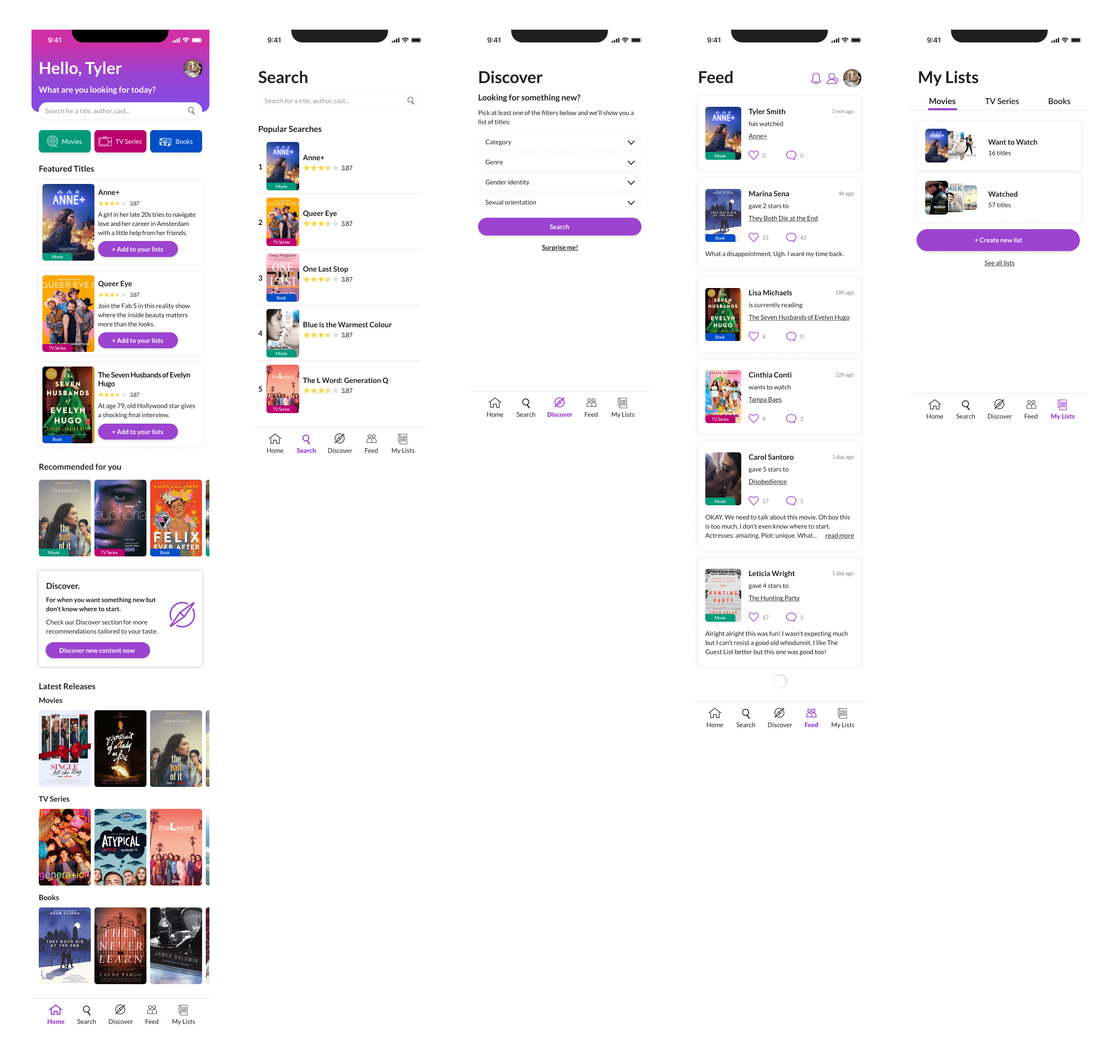
Wireframing
When I created the wireframes, I decided to make the pages the most connected as possible. For instance: from the homepage, you can get to the Discover page; the search and feed offer also recommended content; the bottom navigation menu allows users to access the search at all times. This was thought to ensure that the user always felt compelled to move from one page to the next and have a highly useful and deep experience.
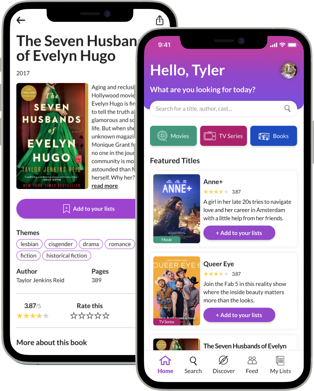
Visually, one of my priorities when wireframing was to emphasize movies and TV series posters and book covers so that they could pique users’ interest and be easily recognizable. In addition, I wanted users to be able to quickly identify what category of content an image belongs to, which is why I added the labels with the categories’ names (note the black labels on the homepage, search, and feed pages below).
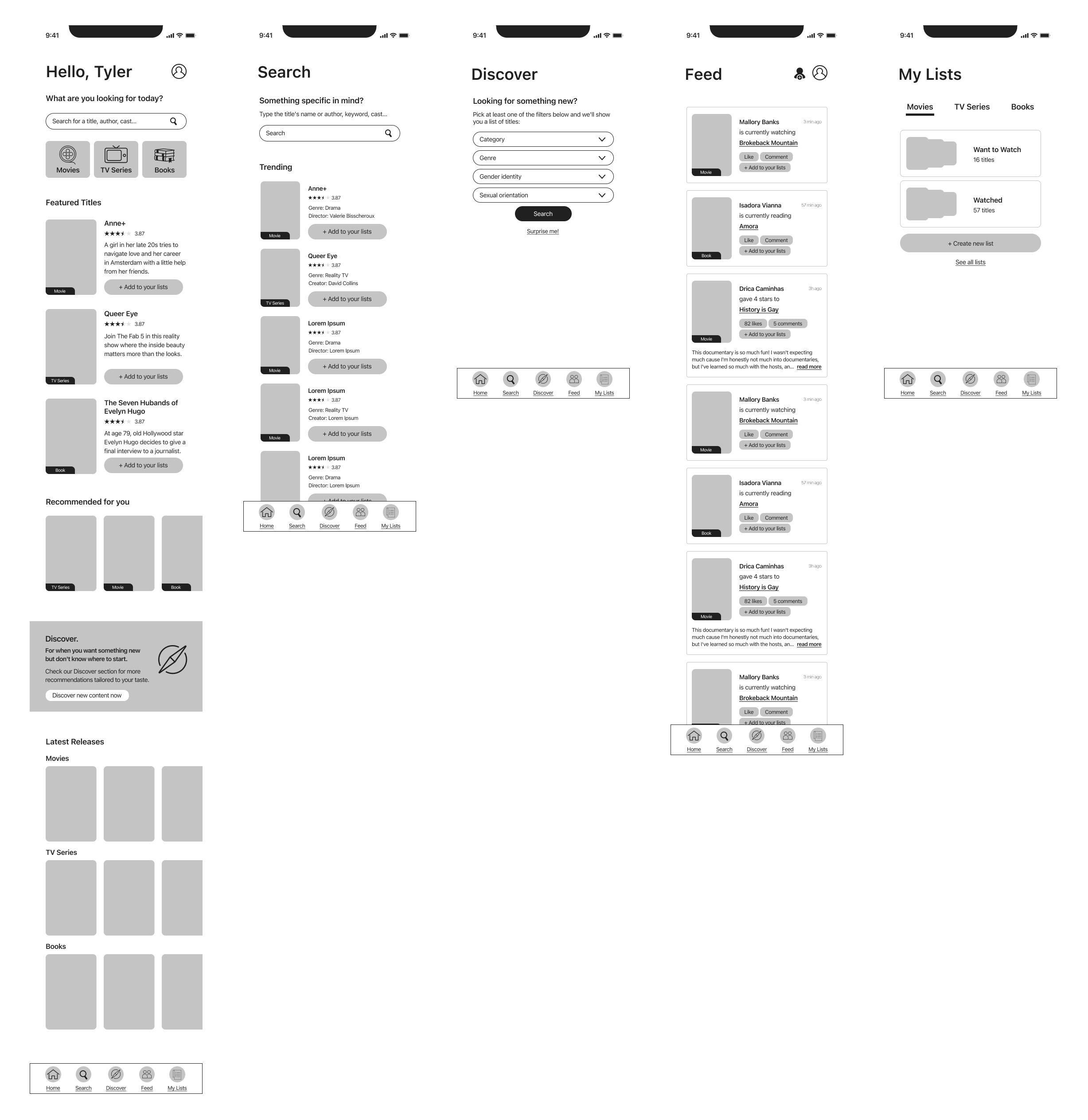
Wireframes of Pridelogue's homepage, search, discover, feed and my lists pages
Click on the image to enlarge it
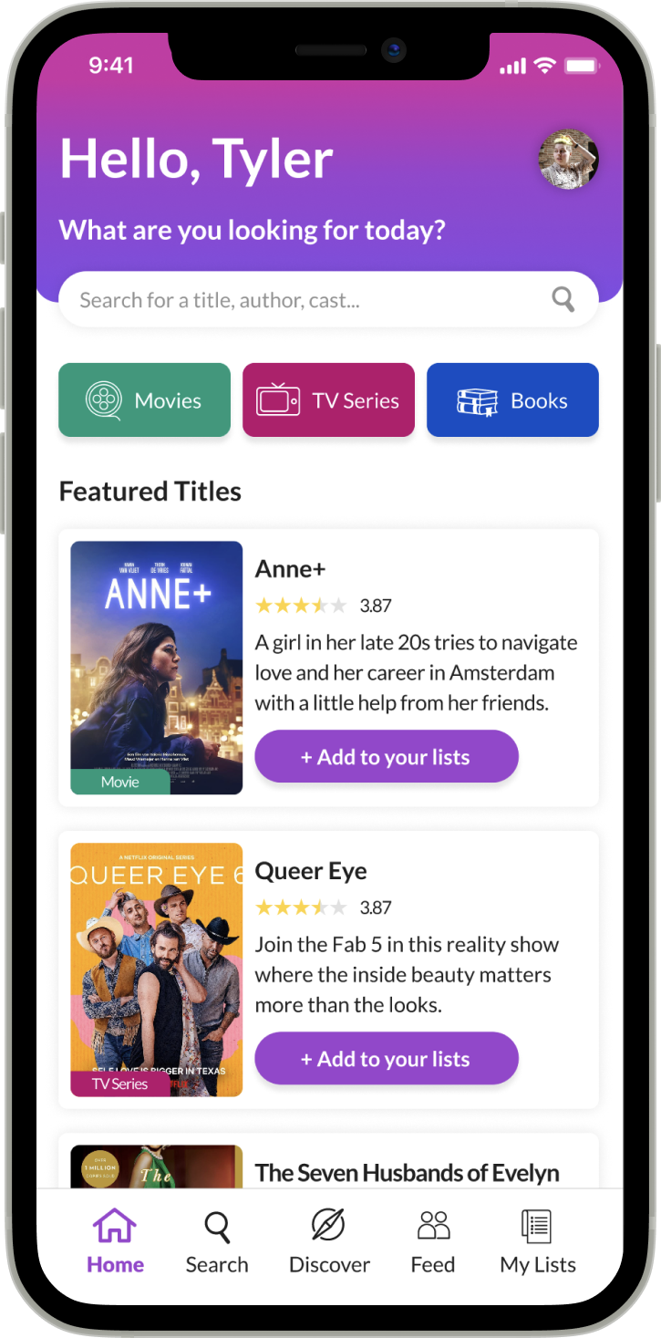
High-Fidelity Prototyping
After finalizing the wireframes, I moved to the high-fidelity prototype. At this stage, I made final decisions about what elements would be included in each component.
In terms of colours, asides from black and white, all the colours selected to compose Pridelogue's UI were picked from the gay, bisexual and lesbian flags. I tried to avoid the rainbow to give the app a distinctive look, but also kept it colourful.
The same pages seen previously, now as a high-fidelity prototype
Click on the image to enlarge it
5. Testing
Purpose
I conducted a usability test with the purpose to find out if people were able to perform the basic tasks proposed by the prototype, which were:
Finding a book page (The Seven Husbands of Evelyn Hugo)
Find a movie page (Blue is the Warmest Colour)
Find the movie's trailer on the movie's page
Find friends’ reviews on the movie's page
Find a TV series (The L Word: Generation Q)
Find out on which streaming platform the show could be watched
Find out a section on the app that would give content recommendations without using keywords (Discover page)
Testers
All five testers were somehow similar to Tyler, the persona, so they were part of the LGBTQ2+ community, into movies, TV series and books and, consequently, potential Pridelogue users. All tests were conducted via Zoom and lasted around 20 minutes.
Findings
By the end of the interviews, I could conclude that all tasks were being performed very easily, except for the trailer one. I had at first placed the trailer player inside the synopsis window, but people were not able to find it. Therefore, I decided to move it directly to the movie/TV series page.
6. Finished product
After making some corrections based on the feedback I got on the test and making some UI finishing touches, Pridelogue came to life!
Feel free to access the high-fidelity prototype and explore the app.
7. Learnings
One key opportunity I had was to exercise critical thinking when it came to content hierarchy. At first, I wanted to add as much information as possible about the titles. I made multiple iterations before concluding that sometimes less is more, and opting to simplify some components.
With this project, I was able to execute for the first time all the stages involved in the creation of a product completely by myself. While I love working with other people and learning from them, working alone gave me the opportunity to become a more independent and experienced designer.