
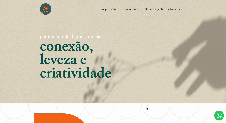
3F Conteúdo
1. Overview
3F Conteúdo is a Brazilian marketing and content agency. They are a female-owned family company that offers multiple services for a diverse client base, ranging from broadcasting channels to private schools.
They focus on creating an online presence for brands by providing strategic consulting, social media management, multimedia content creation, analytics and more.
Date and duration
3 months
(May - July 2023)
Team
• Juliana Saboya
(UX Designer)
Tools
• Wix
Deliverables
• Implemented website
2. Problem Definition
Origin
3F Conteúdo was approaching its fifth anniversary and with that, the founders felt the need to undergo a branding revamp to modernize their presence in the market. Consequently, they redesigned their logo, and we initiated the website's redesign process.
What was the problem?
Based on the client's needs and the website's analysis, I formulated the following problem definition:
How can modernize 3F's website to align with their new brand while enhancing their online presence through a new website?
3. Discovery
Competitive Analysis
Since the primary goal of this project was aesthetic improvement, the Discovery phase was reduced to an analysis of references that appealed to the client. They shared with me the websites of three Brazilian marketing agencies:
This agency holds two important similarities with 3F: being female-owned and a smaller-scale business. In addition to their single-page presentation, they create marketing content on their blog.
One pressing issue with this website is the lack of white space and standardized spacing, which ultimately affects the content separation and increases the user's cognitive load.
However, they provide good visibility of system status by maintaining the sticky menu at the top of the webpage.

Blin My Marketing Agency's website
Click on the image to visit the page
Frat is a larger agency, serving many international and national clients.
On their website, they invested in a creative and bold interface with numerous animations and interactive elements.
However, it's interesting to see that the website maintains some simplicity, particularly in terms of content. They are straight to the point but also allow the user to delve deeper if they wish by accessing other pages or lightboxes.
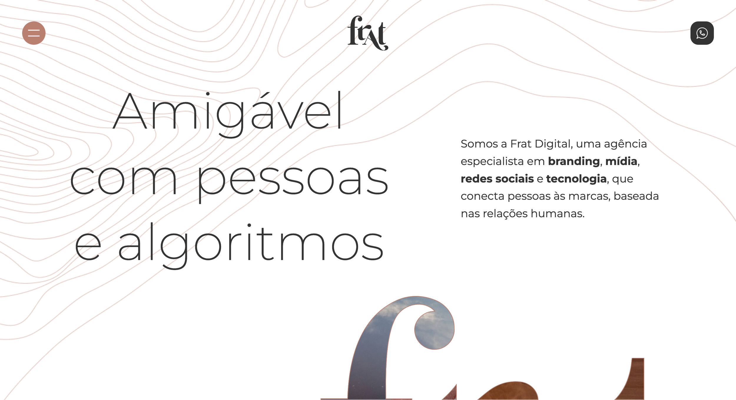
Frat Marketing Agency's website
Click on the image to visit the page
Artplan is one of the largest marketing agencies in Brazil, part of a giant conglomerate involved in Communications, Entertainment, and other digital services.
Given their reputation and extensive portfolio of campaigns and advertisements, they evidently require a robust website with multiple pages containing detailed information about their work.
Similar to Frat, although they have invested heavily in a disruptive interface, their website is not content-heavy.

Artplan Marketing Agency's website
Click on the image to visit the page
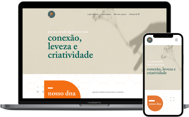
Regardless of the different sizes of these agencies, one similarity stands out: they all follow a similar structure on their homepage. This includes a hero, a presentation of their services, a client portfolio, an "about us" section, and contact information. In fact, this was already the structure that 3F was following in the first version of their website.

3F Conteúdo's original website screenshot
Click on the image to enlarge it
4. Designing
As per the client's request, the website had to be developed on a CMS platform to eliminate the need to involve a developer in the project and to allow for easy updates. Additionally, they requested a single-page website, eliminating the need to create a sitemap.
Consequently, the project began directly on Wix, the platform chosen by them.
Iterations
Starting with the “Nossos Serviços” (Our Services) section, initially, I replicated the content from the original website. They originally had four services and a content-heavy description.

First version of the Our Services section
Click on the image to enlarge it
The client then changed the content to eight services and reduced their descriptions. After numerous test and considering the component options available on Wix, we implemented the following solution:
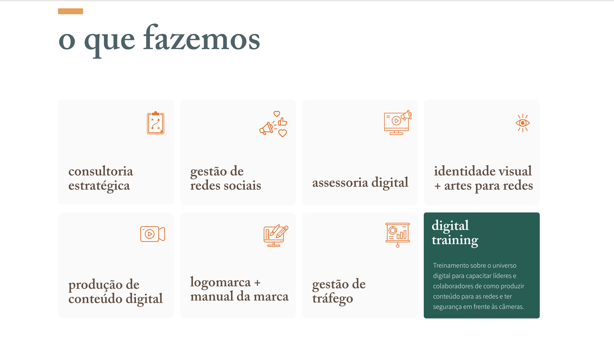
FInal version of the Our Services section
Click on the image to enlarge it
We selected this component featuring eight cards that display a description upon mouse hover. On the mobile version, since there is no mouse hover, the icon, title, and description are condensed on the card.
While the desktop solution may not be optimal in terms of accessibility since screen readers will not be able to read the content "behind” the card, the compromise was made to ensure interaction with the cards. However, the name of the service remains accessible to screen readers.
Branding and style
The website incorporates the recently developed logo and branding guidelines.
Utilizing Wix's components, I implemented elements from the branding project as backgrounds, creating a parallax effect and providing more depth and clear separation between modules, as seen below.
Gif showing the illustrated background with parallax effect
5. Finished product
After approximately three months of work on this project, we successfully launched it into production.
6. Learnings
This project has provided valuable learning experiences for me. Working extensively with Wix has enhanced my proficiency with this popular tool, which is widely used by smaller businesses. As I have been involved in freelance work, becoming more familiar with Wix is advantageous.
Additionally, this project has enabled me to hone my skills in finding creative design solutions within technical limitations. Without developers available to implement custom components, I had to rely on my creativity to design solutions that met the client's needs.